
Point Zero Forum Rebranding
01 — Overview
Objective: Point Zero Forum is an exclusive, invite-only, in-person gathering of select global leaders, founders, and investors. The forum aims to:
Advance the Future of Financial Services (FOFS): Develop new ideas surrounding decentralised finance, Web 3.0, embedded finance, and sustainable finance.
Drive Investment Activity: Connect leading founders with VCs, private banking clients, family offices, and PE houses.
Dissect Regulatory Considerations: Bring together public and private leaders to address regulatory landscapes for each FOFS development.
Target Audience:
Senior-level attendees, including global policymakers, pioneering founders, and prominent investors.
Official Channel: Point Zero Forum Website
02 — The Challenge
Despite immense potential within the FinTech space, the industry faces significant global headwinds, rapid technological shifts, and a pressing need for robust regulatory alignment. The challenge lies in creating a unified launchpad where public and private sectors can look at these emerging trends with a fresh perspective, turning industry fragmentation into collaborative momentum. Furthermore, the digital gateway (landing page) needs to effectively communicate this elite value proposition to high-level stakeholders while optimizing user engagement.
03 — The Strategy
To establish the forum as the ultimate birthplace for financial innovation and collaboration, the strategic approach focuses on a multi-layered design narrative backed by an optimised user experience:
Conceptual Dualism: Developing two distinct creative directions (Concept 1: The Fresh Wave Perspective and Concept 2: The Organic Metamorphosis Nucleus) to capture the movement of the industry.
Landing Page Refresh: Structuring a clean information hierarchy that seamlessly guides senior-level traffic through four core pillars:
First Impression: An impactful Hero Image / Key Visual coupled with an immediate entry point to register.
The Value Hook: A clear Unique Selling Proposition (USP) detailing the specific benefits, features, agenda highlights, and keynote speakers.
Social Proof & Streamlining: A dedicated social establishment section displaying partners, supporters, and organizers. To maintain a compact page layout and maximise engagement, a slideshow/carousel interface template is introduced to minimise space.
Conversion Optimisation: Reintroducing a final, prominent Call-to-Action (CTA) section at the footer to capture sign-ups efficiently.
04 — The Identity
Concept 1: The Continuity Twist
Logo Rationale: The logo shape signifies the continuity of innovative thoughts and the longevity of the movement. The combination of the structural ‘O ’ elements and the integrated twists represents the collaborative shift driving the event. The circular elements also serve as a direct symbolic reference to the forum’s title: Point Zero.
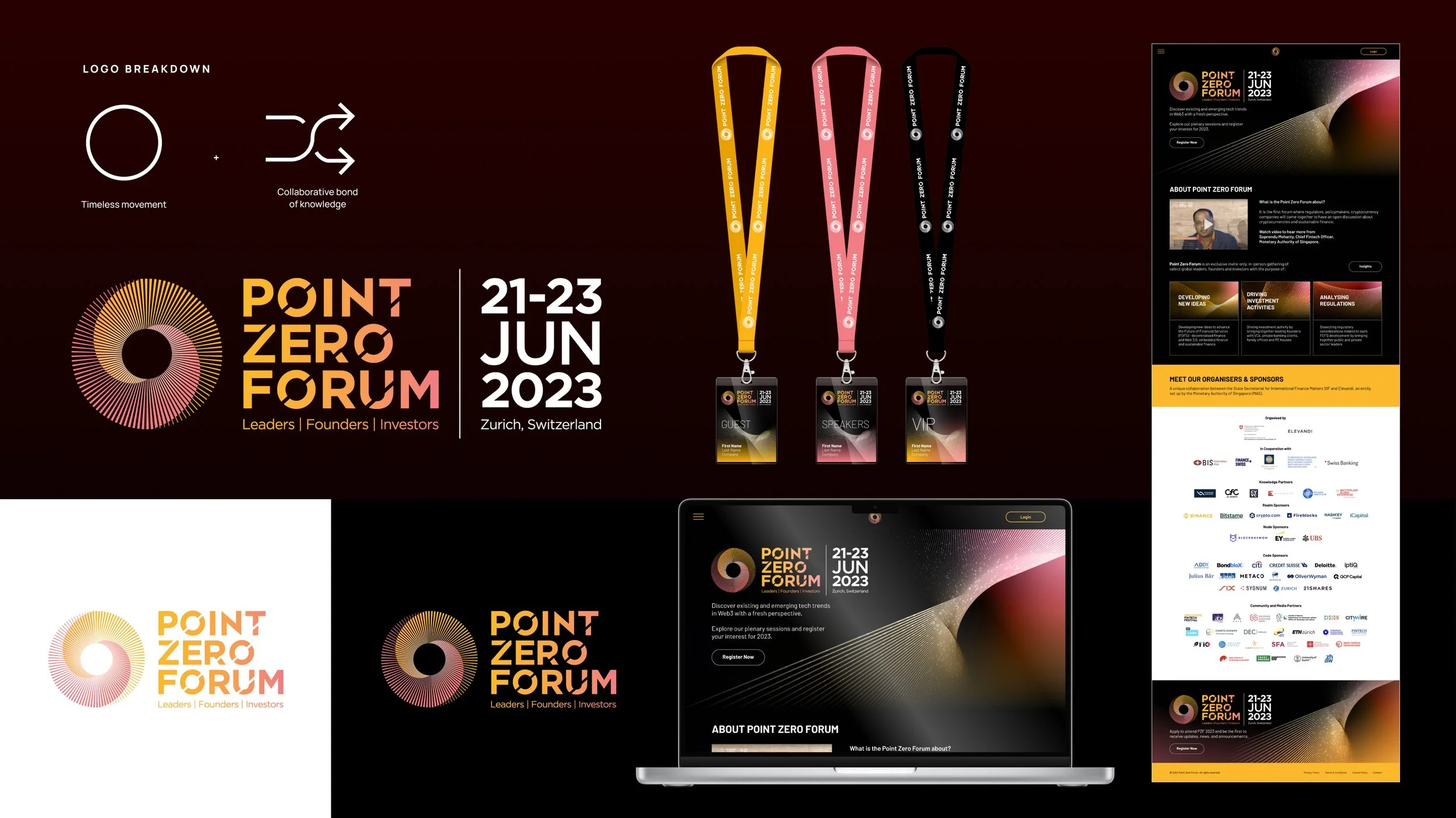
Key Visual: The imagery represents the definitive starting point for the FinTech industry. The layered waves symbolize the incoming tech trends—specifically Web 3.0, Blockchain, NFTs, and DAOs. Everything comes together full circle, illustrating how collaborative effort can directly address rising economic and regulatory headwinds.
Concept 2: The Adaptive Nucleus
Logo Rationale: The logo shape signifies fluidity in adapting to financial shifts and the convergence of new ideas into a powerful centre. The blend of the ‘O’ elements with organic, cell-like shapes represents seamless adaptability and the natural processing of innovation.
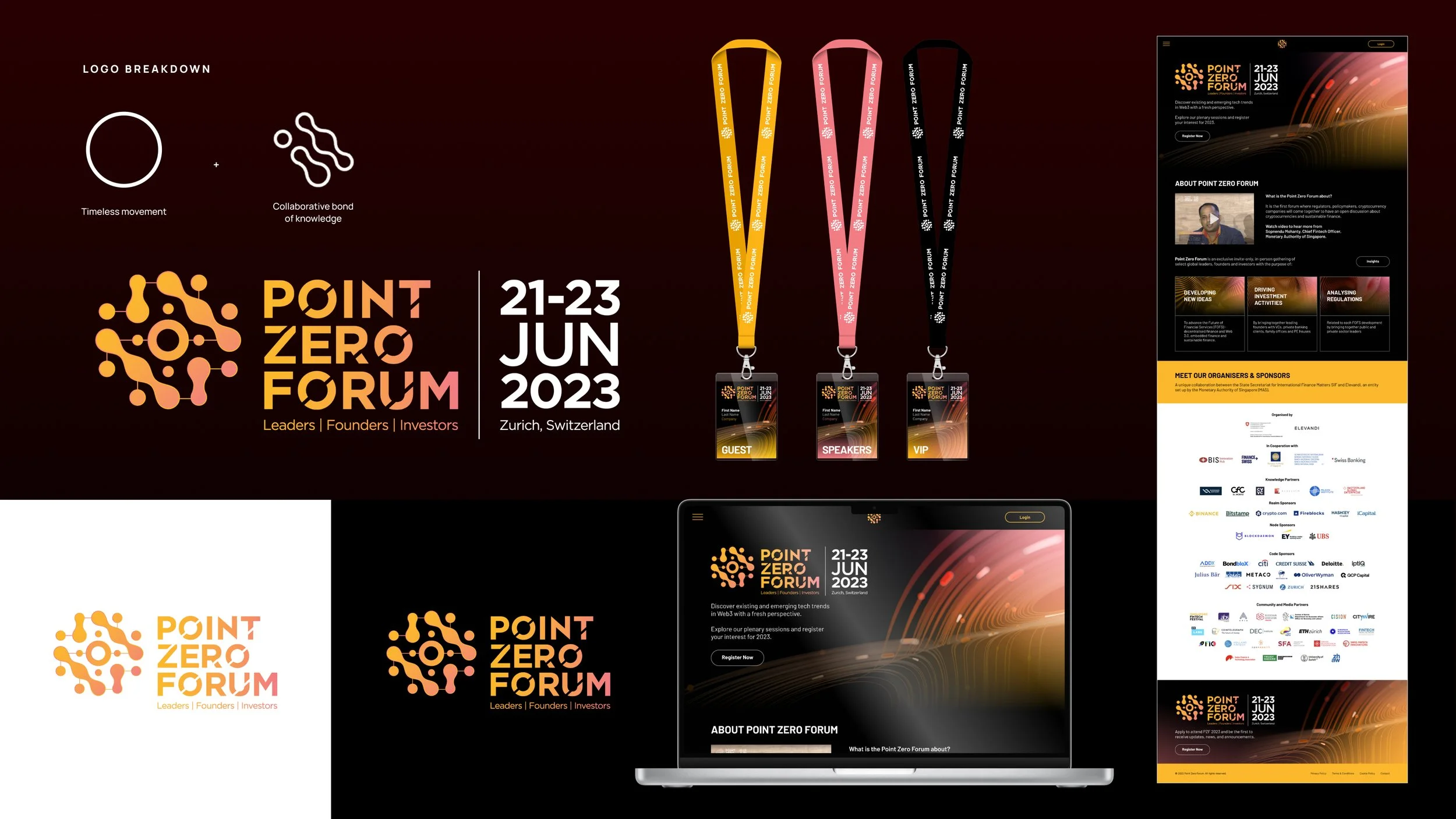
Key Visual: Positioned around the theme of metamorphosis. It frames Point Zero as the organic nucleus where pioneering ideas fuse together, seeding positive actions that ultimately scale to change global lives and broaden financial opportunities despite overarching global constraints.
05 — The System
The design system translates the visual concepts across digital interfaces and event touchpoints to ensure a unified identity for the premium, invite-only event:
Digital Interface: A dark-mode desktop and mobile landing page design utilizing warm, energetic gradients (oranges, pinks, and golds). The visual hierarchy is clean, prioritizing distinct blocks for event content and utilizing interactive carousel layouts for corporate partners.
Event Ephemera: Premium physical touchpoints, including specialized lanyards and pass badges designed specifically to differentiate event tiers (Guest, Speakers, and VIP).