DebtFlow is a dedicated debt management system engineered to solve the problem of fragmented financial obligations. Developed as a comprehensive full-stack web application, it moves away from standard expense trackers to treat debt as a structured, time-based liability. This case study breaks down the initial design sprints, navigation strategy, and engineering architecture built to give users absolute clarity over their financial exposure.
The Ideation & UX Strategy
The strategic vision for DebtFlow began by recognising a distinct psychological pain point: Debt is uniquely stressful because it is often invisible, scattered across multiple credit cards or lenders, and heavily dependent on changing deadlines. Traditional budgeting apps bury these long-term obligations under daily grocery or coffee expenses, failing to show the big picture.
The objective of DebtFlow was to eliminate this mental tracking overhead. By reframing liabilities from scratch, the product gives individuals and small business owners an intentional, highly visual command centre built solely around cash flow visibility and deadline tracking.
The Functional Experience
To transform complex financial data into an approachable daily tool, the platform’s interface was mapped out across distinct, cohesive operational zones:
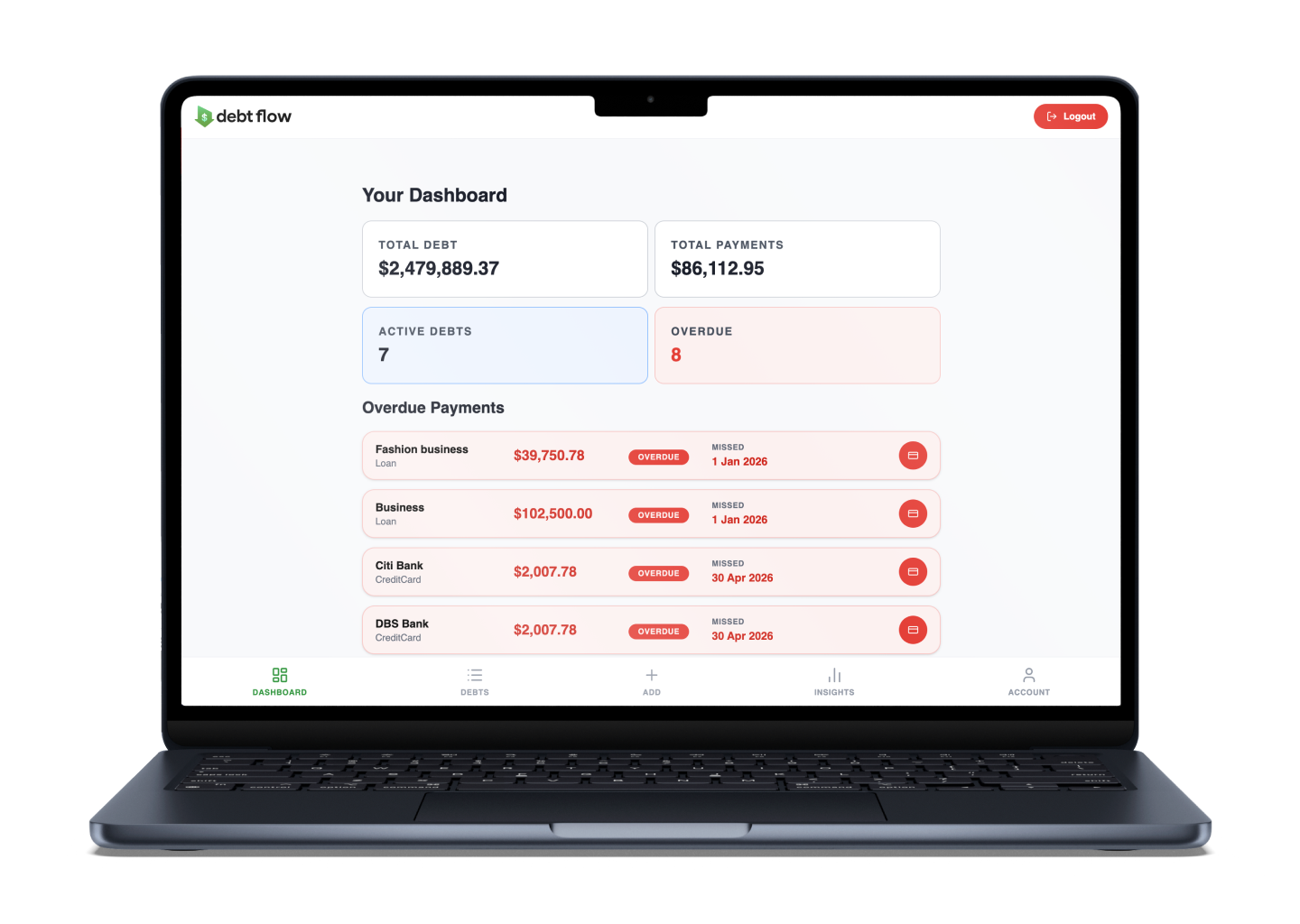
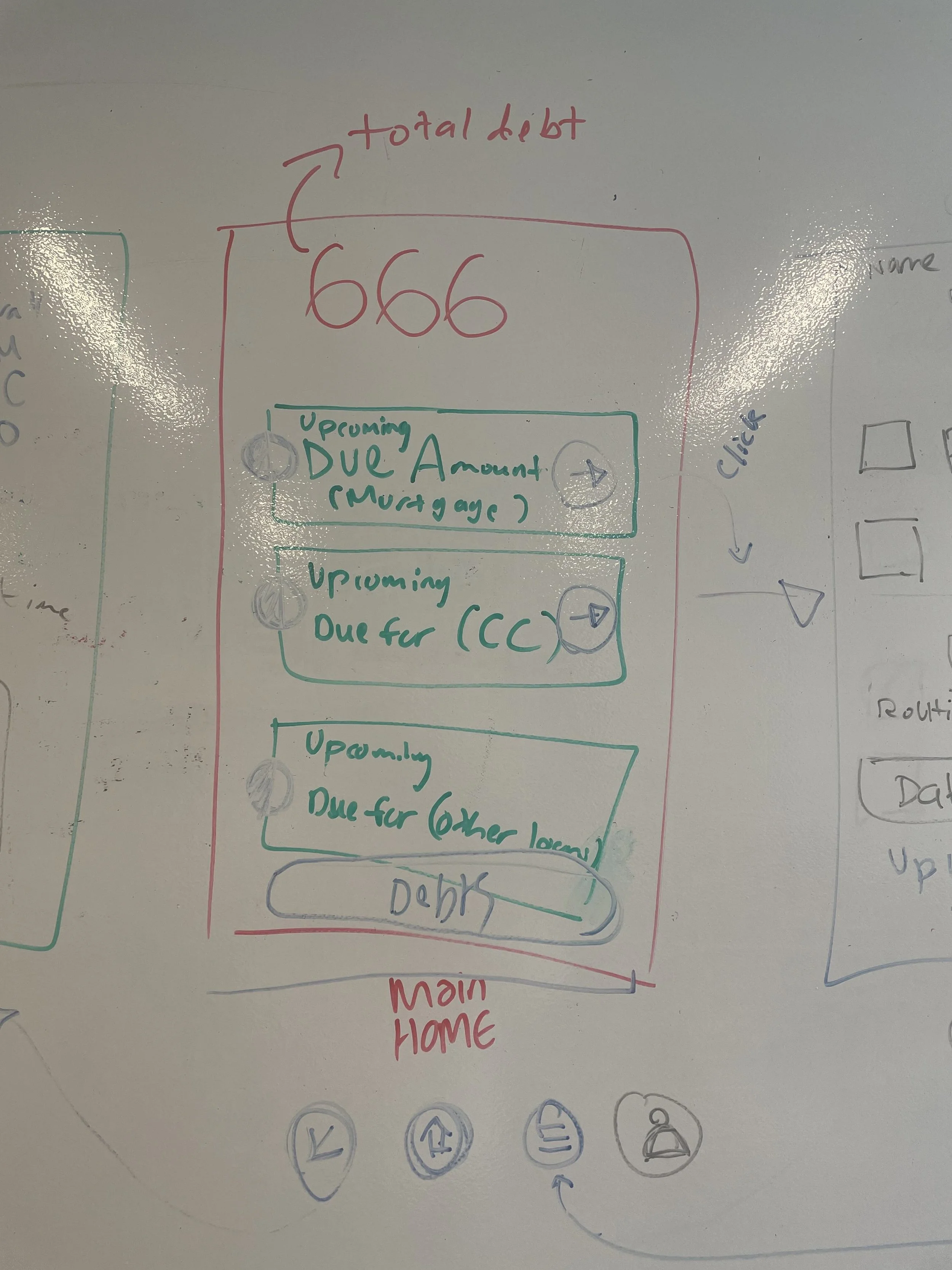
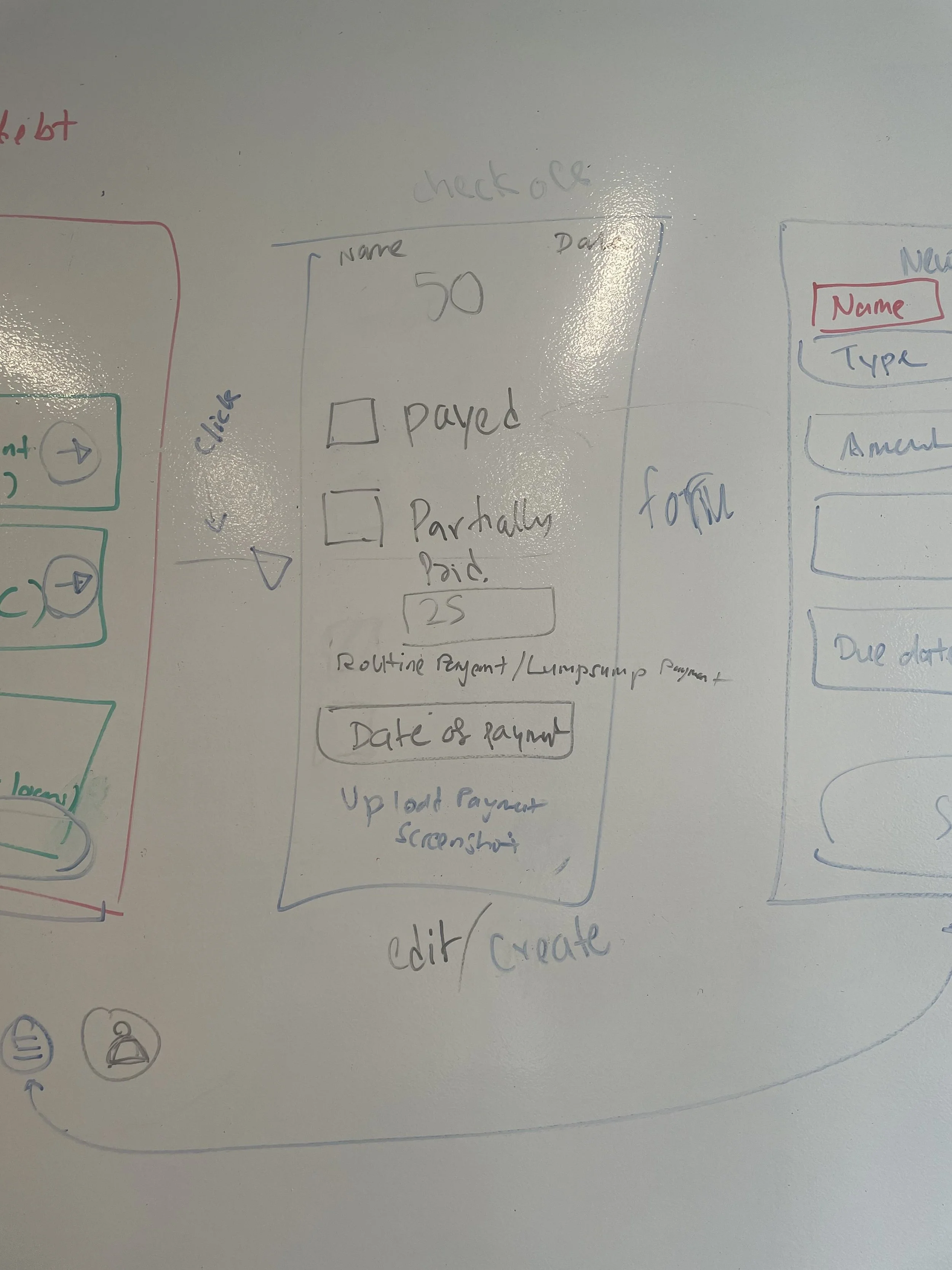
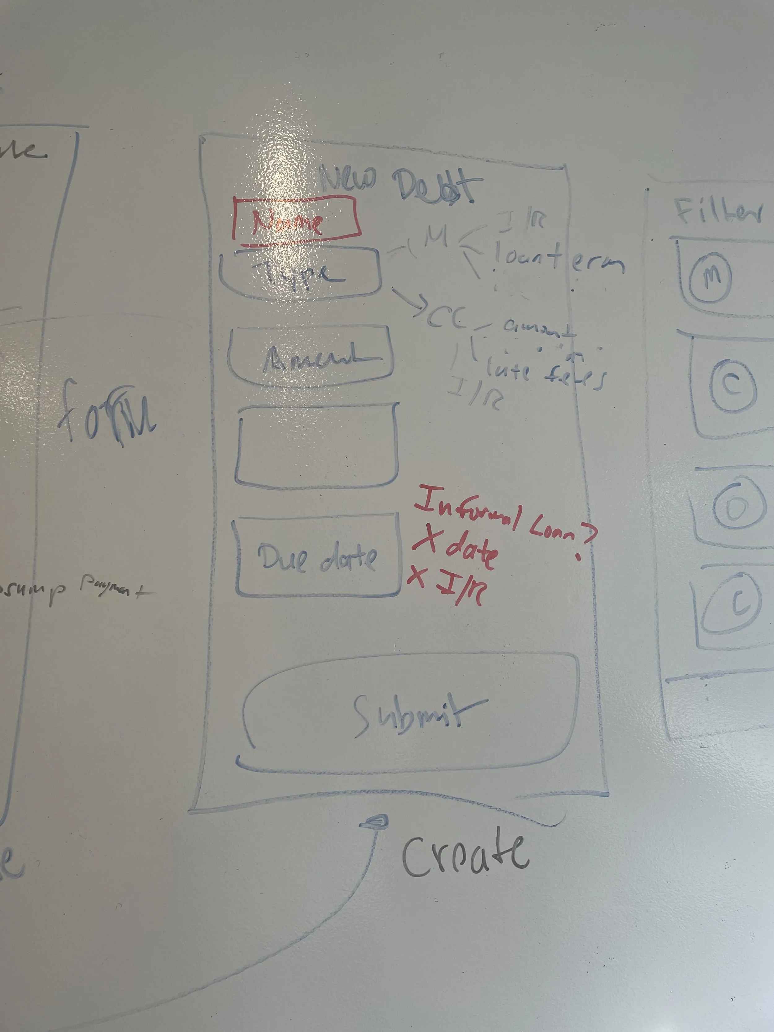
The Aggregated Dashboard: A master view designed to instantly calculate total financial exposure, highlight immediate upcoming deadlines, and track real-time repayment progress.
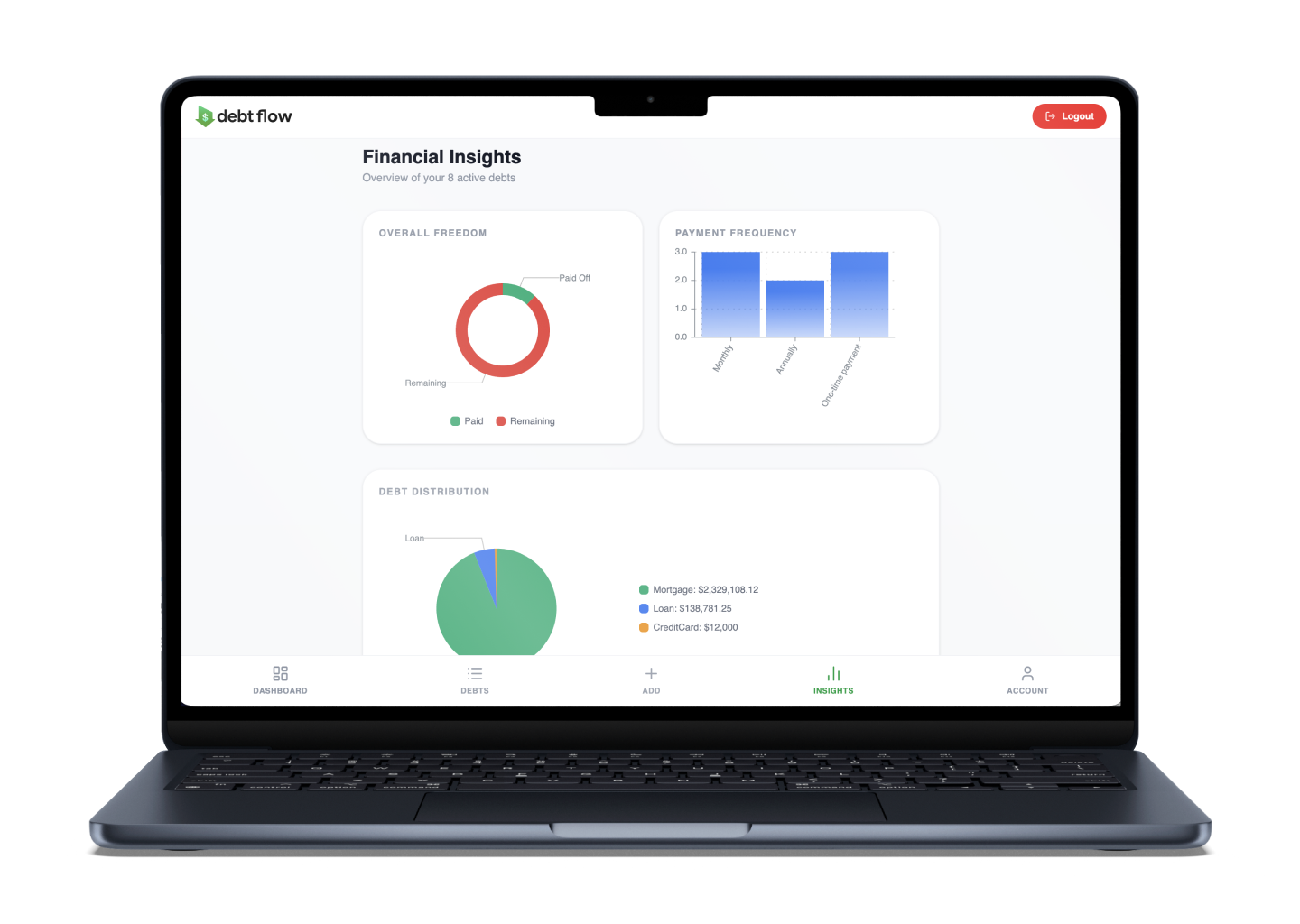
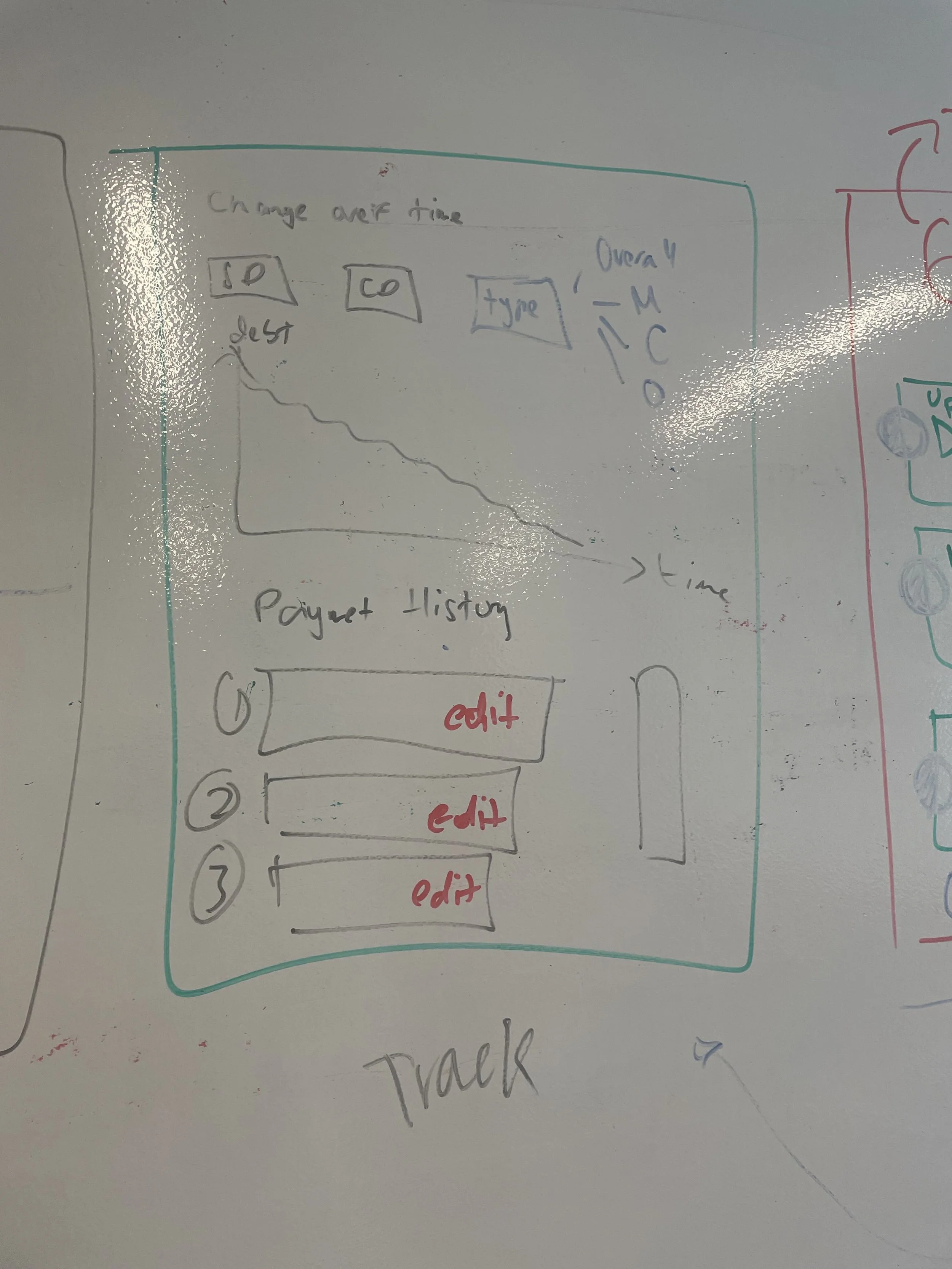
The Insights Engine: A space dedicated to parsing repayment paces, tracking financial health habits, and forecasting cash flows.
Secure Access Portals: A private ecosystem where users can securely register, log in, and ensure their sensitive liability records remain completely private and isolated to their account.
The Development & Process
Building the foundation of DebtFlow required translating initial visual sketches into a highly stable, responsive digital structure. The initial development phase focused on establishing a professional engineering blueprint:
Dynamic Navigation Routing: Moving past static screens, a flexible website system was mapped out. The architecture handles automatic direction rules—ensuring a user landing on the site is seamlessly routed to the dashboard, while embedding automatic lockouts that shield internal financial data from unauthorised eyes.
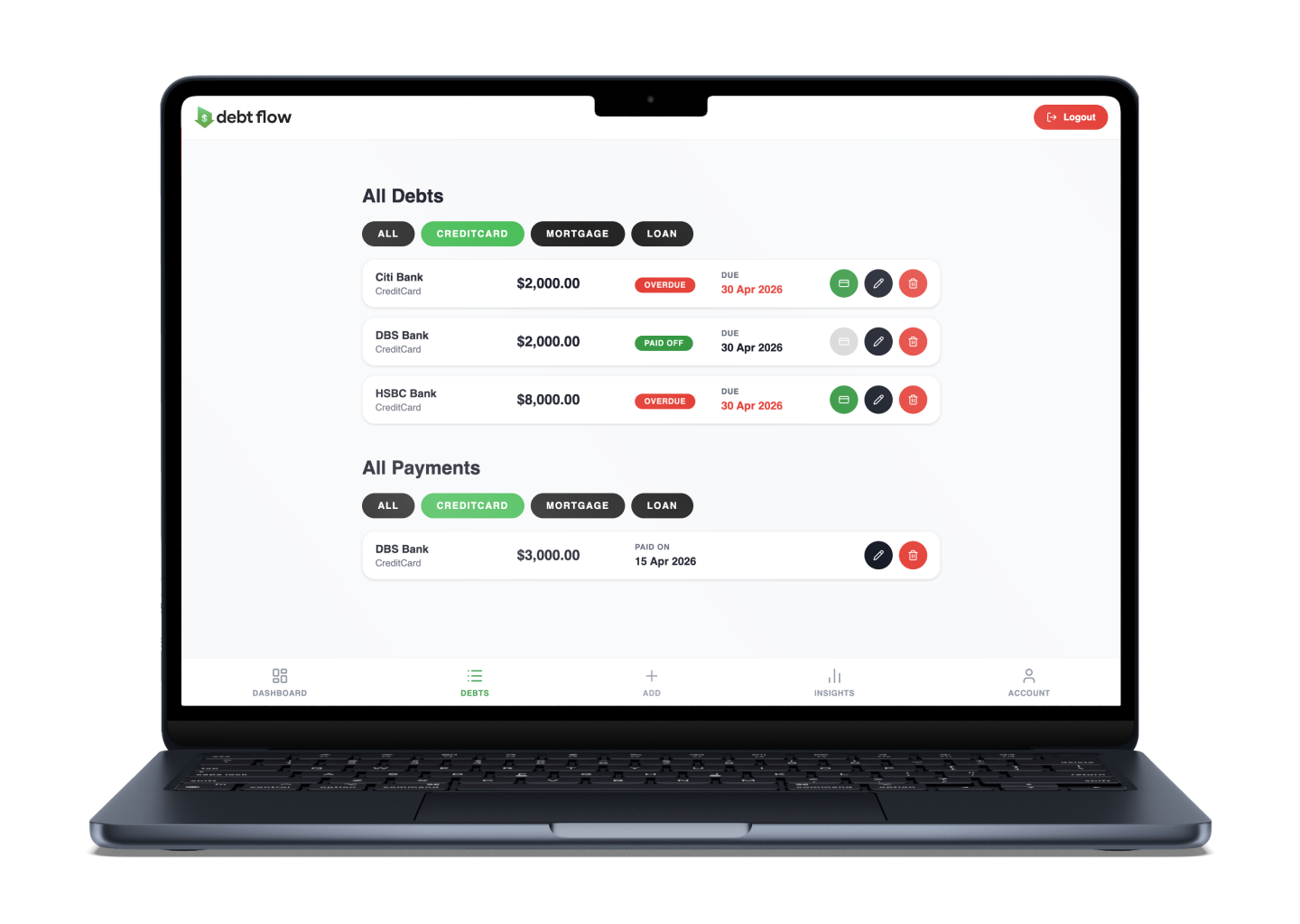
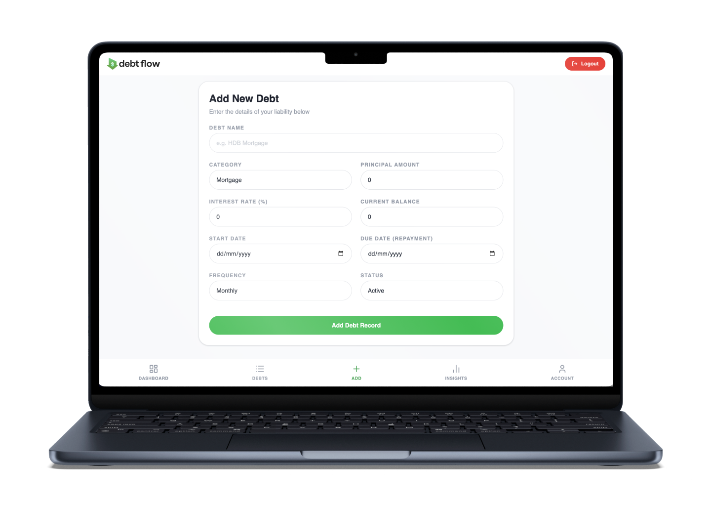
Thumb-Friendly Navigation UI: The navigation experience was optimised specifically for mobile behaviours. A premium look was established by integrating a clean icon system, paired with custom active-state colour transitions that give users instant physical feedback as they move through the app. The layout pairs a secure top branding header with a fixed bottom menu bar tailored for natural mobile ergonomics.
Structural Refactoring & Cleanliness: To ensure the system remains easy to scale, files and page names were aggressively streamlined. Every primary view was initialised with standardised placeholders to exhaustively test data pathways and navigation flows.
System Testing Preparation: Parallel to the visual construction, dedicated backend testing suites were configured from day one, preparing the infrastructure to smoothly receive and validate live data requests without bottlenecking.
Accessibility & Quality Assurance
Managing liabilities is emotionally taxing; therefore, the visual system was designed to reduce anxiety through deliberate structure and styling. A clean, dashboard-style interface utilising a modular card layout keeps information perfectly organised into digestible blocks. This styling approach is reinforced by a semantic, universally recognised colour psychology wheel: red automatically surfaces urgent overdue items, green indicates active or fully resolved statuses, and neutral blue flags educational insights. Micro-typography adjustments—such as clean, wide-spaced headers paired with bold, glanceable numeric values—ensure a user can audit their financial standing in a fraction of a second.